Saturday, April 27

A Curated Gallery of Beautiful Fonts for Creative Designers

39,832 Premium Fonts

«Back ·

Tracking: { 'Country Code': 'US', 'Language Code': 'EN-US', 'Email Hash': 'unknown', 'Vendor User Id': 'unknown', 'Vendor Id': 'unknown', 'Customer Type': '', 'Offer Code FONT Download
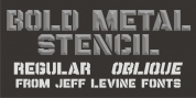
tracking: {
            'Country Code': 'US',
            'Language Code': 'EN-US',
            'Email Hash': 'unknown',
            'Vendor User Id': 'unknown',
            'Vendor Id': 'unknown',
            'Customer Type': '',
            'Offer Code font preview Previous: tracking: {
            'Country Code': 'US',
            'Language Code': 'EN-US',
            'Email Hash': 'unknown',
            'Vendor User Id': 'unknown',
            'Vendor Id': 'unknown',
            'Customer Type': '',
            'Offer Code Font Next: tracking: {
            'Country Code': 'US',
            'Language Code': 'EN-US',
            'Email Hash': 'unknown',
            'Vendor User Id': 'unknown',
            'Vendor Id': 'unknown',
            'Customer Type': '',
            'Offer Code Font
tracking: {
            'Country Code': 'US',
            'Language Code': 'EN-US',
            'Email Hash': 'unknown',
            'Vendor User Id': 'unknown',
            'Vendor Id': 'unknown',
            'Customer Type': '',
            'Offer Code downloadDesigner: Donald Beekman
Publisher: VetteLetters
VLNL Berlagebrug 
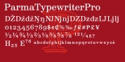
Designer Donald DBXL Beekman daily crosses the Berlage bridge spanning the Amstel river in Amsterdam. The Berlagebrug was built as part of the city planning project 'Plan Zuid' by H.P.Berlage and opened in May 1932. Its name, carved out of two granite headstones, sparked the design of this font family. The original lettering is attributed to Anton Kurvers in the early 19th century, and can be seen on many Amsterdam buildings and bridges. It's typical lettering of the Amsterdamse School, the Dutch equivalent of the expressionist art deco architectural style, and mostly known for its extravagant brick work. VLNL Berlagebrug is a rounded display font that comes in three outline styles matching the building materials used in the bridge. Gietijzer (cast iron) is smooth, Zandsteen (sandstone) has a softly distressed outline, and Graniet (granite) is outspoken rough and crumbled. The capital letters in VLNL Berlagebrug are in the Amsterdamse school style, the lowercases are more straight alternate capitals, giving you more design options.


amsterdam amsterdamse school art deco art nouveau black bridge caps only cast iron constructed crumbly display dutch granite headline heavy historic rough rounded sandstone sans stone
Back to the top